An Elegant App - Part 1
By Bryan Maynard, OCI Software Engineer
July 2012
Introduction
This is the first in a series of articles, published by SETT in the coming months, on creating compelling web application interfaces.
This installment will present the web development landscape, introduce the Mobile First Design methodology, and provide a simple example of applying Mobile First Design to an existing web application.
Part two in this series will look at how we can use CSS Animations to make our web application interface more intuitive, appealing, and pleasant to use.
Part three in this series will look at how we can use CSS Transformations in interesting ways to further enhance our web application interface.
Part four in this series will introduce Responsive Web Design, detail how Responsive Web Design relates to Mobile First Design, and demonstrate how we can scale our web application interface beyond mobile devices.
The bad news
Building anything on the web is hard. There are dozens of web browsers in use throughout the world. There are several, in some cases competing, standards bodies drafting the rules we developers follow when building web applications. There are also new types of devices connecting to the web everyday - each with their own unique set of capabilities and limitations.
The web is a moving target. The web has evolved from supporting only traditional (mouse and keyboard based) interactions to supporting interactions catering to people with disabilities (such as screen readers), touch based interactions, and interactions based around specialized input methods (such as a TV remote control). The web continues to evolve daily. Standards like HTML5 and CSS3 will not be finalized for almost ten years, and yet are in use today.
The good news
Part of the web's rapid evolution has been a rapid development of best practices for building web application interfaces. It is possible to leverage bleeding edge standards while supporting legacy devices from a single interace. It is also possible to accomodate a wide range of users (users with special needs, non-english speaking users, etc) from a single interface.
It is possible to build an elegant web application interface that spans many devices, interaction methods, and spoken languages. With the appropriate knowledge, it is possible to build this elegant web application interface in such a way that it adapts itself to the web's rapidly evolving landscape with little or no effort on our part.
How do we go about doing this? Where do we start?
Mobile First Design
Mobile First Design (MFD) is a methodology for building web application interfaces. In MFD we design a web application interface for mobile devices and scale up from there. Mobile First Design (MFD) is closely related to responsive web design. This article will focus solely on the ideas behind, implementation of, and the realistic viability/challenges to MFD.
More people are increasingly using mobile devices to produce and consume content. Mobile devices like smart phones and tablets are a more natural and convenient way for most users to interact with content. Smart phones specifically are great for content interaction because users have them close and use them constantly.
The mobile space is also exploding, to the tune of 1.186 billion active mobile broadband subscriptions worldwide in 2011. Mobile devices are quickly becoming a common way to access the web around the world. 10.1% of worldwide pageviews came from mobile devices in May 2012.
As is always the case, being ahead of the curve is far better than trying to stay in front of a tidal wave. To be relevant on the web of next year, one must be focused on the mobile user's experience. Whether we like it or not, smaller screens on increasingly mobile devices are the future.
In a perfect world
Even in a perfect world, MFD is the opposite of easy - anything worth doing always is. The only way to succeed in MFD is to limit the problems you are trying to solve in each iteration as much as possible and iterate quickly.
Even in a perfect world, all devices are not created equal. Each class of device has unique benefits, use cases, and strengths. Embrace that. Do not try to provide a single user experience across all devices, that is impossible. Instead carve a specific, unique, and cohesive user experience for each class of device you want to support.
Implementing a successful mobile first design means iteratively building Minimum Viable Products (MVP). Each new supported device type should be allotted the minimum required effort to make the application viable for that device level - nothing more. Remember: all devices do not need to implement all of your application's features. Divide and conquer. Build your application's interfaces to the strengths of each device type it will be running on.
Building a MVP using an MFD approach forces a focus on the most important product features. Only the most important features can be added to the interface because of the limited screen space. This means that instead of overwhelming a user with features, we have an elegant web application that does one thing, and does it well.
As we scale our application to different devices we can progressively implement features inline with the new device's capabilities. This practice is known as Progressive Enhancement. Progressive enhancement is usually a better choice for web development than graceful degradation. The two approaches are summarized in the image below:
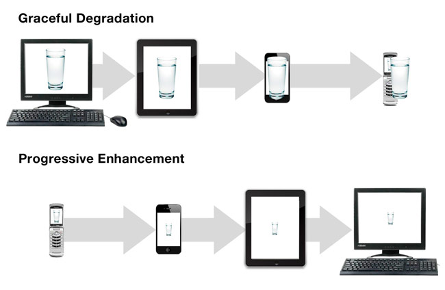
Image courtesy of http://bradfrostweb.com
If we were building a gracefully degrading web application, we would start with a full featured desktop version. We would then take away features as needed to support additional devices.
This means that we will either end up with multiple code bases (one for each supported device) or have one bloated code base. Separate code bases would make maintenance much more difficult. A single code base means that a device will only use a small fraction of the code it downloads. This is especially problematic for devices with slow network connections or limited processing capacity.
The Progressive Enhancement approach would be to build a web application interface for the smallest device first. Then we would augment the existing code to add new device support. This approach means that a device only gets the code it needs. It also means we have a single code base to maintain.
Additionally, implementing progressively enhanced MVPs for the smallest, most limited device first guarantees the shortest development cycle, the fastest time to market, and the most focused, streamlined user experience possible.
Using tools like Modernizr and media queries it is possible to detect a device's feature set and dimensions. Modernizr is a javscript library that provides feature detection. Media queries are CSS constructs that scope style rules based on properties of a device's display.
Using feature detection and media queries allows a web application to load exactly what is appropriate for the device it is running on. This means that a single code base can intelligently scale up - loading content and displaying UI elements when appropriate. Using a single code base also supports maintainability.
It's not a perfect world
As I am sure you are aware, it is not all sunshine, roses, and unicorns in our world. There are many challenges standing between us and a successful MFD implementation. By deconstructing some of the biggest road blocks we can smooth the path and start our journey to a successful MVP.
The first thing we need to determine is the core audience for our application. This may be a superset of our current application's non-mobile user base, it could be a subset of our non-mobile user base, or it could be a different set of users all together.
Defining the audience for our product will help us determine what device(s) we need to target. Once we have our initial device list we can research the each device's capabilities. Once we know the capabilities of the devices our target audience uses we can begin defining the functionality for our first MVP.
Do our users use smart phones, tablets, or both? Would our users need or expect the same functionality from smart phone and tablet versions of our interface? If not, what would be different? Will our users be moving (walking, riding in a car, etc) while using our application? How long will our users spend with our application during a typical session?
Answering questions like these will provide us a good starting point for determining what device we should target first, and what features that device needs to have.
A key thing to remember about MFD is that the user's device defines our application's context. Only certain functionality makes sense in certain contexts. For example, the goal with MFD is not to cram all the features of a desktop publishing suite into a feature phone. The goal of MFD is to distill the essence of a desktop publishing suite into an something that makes sense and is a joy to use on a feature phone.
It may seem ridiculous to think that a desktop publishing suite could be in any way usable on a feature phone. It wasn't long ago, though, that it seemed ridiculous to think that smartphones would be extremely popular (and incredibly powerful) gaming devices.
In many cases MFD is actually MFrD (Mobile First re-Design). Many applications exist on the web that do not have mobile UIs. In these situations, MFD would probably make the most sense as part of an application re-design or comprehensive update.
In some cases, where legacy concerns are especially troublesome, multiple code bases may be required - one for the current, legacy UI and another for the mobile UIs.
Web sites that make heavy use non-standard technologies like flash or silverlight, for example, would need a separate code base for mobile interfaces. Once the mobile interface is in place it could be scaled up to the desktop and the non-standard version could be retired.
Let's go mobile!
How can we put these design principles into action?
We'll use my own project, AiOIM, as an example. As is fairly typical, it was not developed with mobile first approach. We will rebuild the interface and in the process, get an idea how such a process might be applied to other - more complex - projects.
AiOIM is a Twitter-backed chat client. It's still very early in development (so please dont' be to harsh when judging it) and a relatively simple application. The primary pieces of the UI are:
- The user search box
- Instructional text
- Chat session windows
- Background text
Converting this application to an MFD will not be technically challenging. It will, however, give us a chance to ask and answer the following questions:
- What is our initial target mobile device class?
- What is the minimum required functionality for our target mobile device class?
- How do we optimize our application for our traget mobile device class?
Answering these questions will give us a roadmap for successfully implementing an MFD.
To keep things straight forward we're only going to modify AiOIM's CSS for our MFD solution.
For the sake of brevity, we're just going to target retina iPhones for our MFD. All we need in our mobile chat UI is a button to authorize AiOIM against a user's account, a search box, and a chat window. I am also assuming that users will use AiOIM while moving. Because of this, I will strip away any part of the UI that could be distracting or confusing.
The end result
Following are images showing the difference between AiOIM's original desktop interface and it's new Mobile First design.
What users see first
The mobile screen is much more focused. The "authorize" button is the prominent screen element and the instructions are simple, clear, and prominent (if a bit curt). A bit of text describing exactly what "authorize" means might be helpful. This will be added in Part 4 since the text and it's placement may very based on device.
In the desktop interface, the watermark is the prominent screen element. The "authorize" button is displayed in the top left corner of the screen. There is also some enlightening text at the bottom of the page.
Once AiOIM is authorized
This screen clearly and prominently instructs the user what to do next.
Minor changes are made to the UI indicating the user has authorized AiOIM and can now find someone to chat with. The majority of the screen is unchanged.
Finding a tweeter
Here we see the virtual keyboard obstructing our view of the user list. This is part of AiOIM's current design that will need to be reworked to properly accommodate non-desktop interfaces. We will modify AiOIM's user search to be more flexible in Part 4 of this series.
Here we have a list of users matching the current search criteria.
Composing a message
As with the other mobile screens, distractions are kept to e minimum.
Note that tapping the "say" button dismisses the keyboard, but tapping "Go" does not. The user can tap "Go" to send their message and then tap "Done" to dismiss the keyboard. A web application cannot change the text of the "Go" button or hide it.
This is an example of the difficult decisions that must be made when developing web application interface. Is the redundancy of the "say"
and "Go" buttons acceptable? Would removing the "say" button streamline the interface or create a confusing workflow for the user?
In scenarios like this, the decision chosen is less important that developing and maintaining consistency across decisions.
Either pressing Enter or clicking the "say" button will send the user's message.
As with the mobile interface, there are two ways to send a message here. The advantage the desktop version has in this particular scenario is that there is no virtual keyboard to dismiss. Because of this, the UI responds the same whether the user presses Enter to send their message or clicks "say".
This is an example that different devices have different user interaction paradigms and cannot be treated identically.
A conversation
The conversation element of AiOIM's UI is identical across iPhone and desktop devices.
Note the lack of distraction in the iPhone interface. Aside from the browser chrome, the only thing for the user to focus on is their conversation. By removing all non-essential items from AiOIM we have crafted a streamlined, focused interface that doesn't sacrifice any functionality.
The desktop version of the chat conversation interface.
In closing
By utilizing a Mobile First Design approach we can craft focused, useful web interfaces without sacrificing functionality. In Part 2 of this series (to be published August 1st) we will add support for multiple chat windows. We will introduce CSS Animations and use them to elegantly transition the user between chat conversations.
